Visual identity
Telenor's visual identity is an important part of our expression and how we present ourselves. It signals who we are and thus influences how Telenor is received and perceived by the viewer.
A brand is built over time. Therefore, it is of utmost importance that we always present ourselves in the same way. We must be consistent in our expression. This way, we become clear and easy to understand.
This manual should be used for the correct implementation and execution of the visual identity, which is a local refinement of the global identity.
Welcome to Telenor's visual identity and design guidelines
Here we outline the elements that make our brand unique and recognizable. It’s important for all touchpoints to feel distinctly Telenor, so we’ve set some rules to ensure everything you create is on brand. Use these pages for guidance – but, most importantly, use it for inspiration.
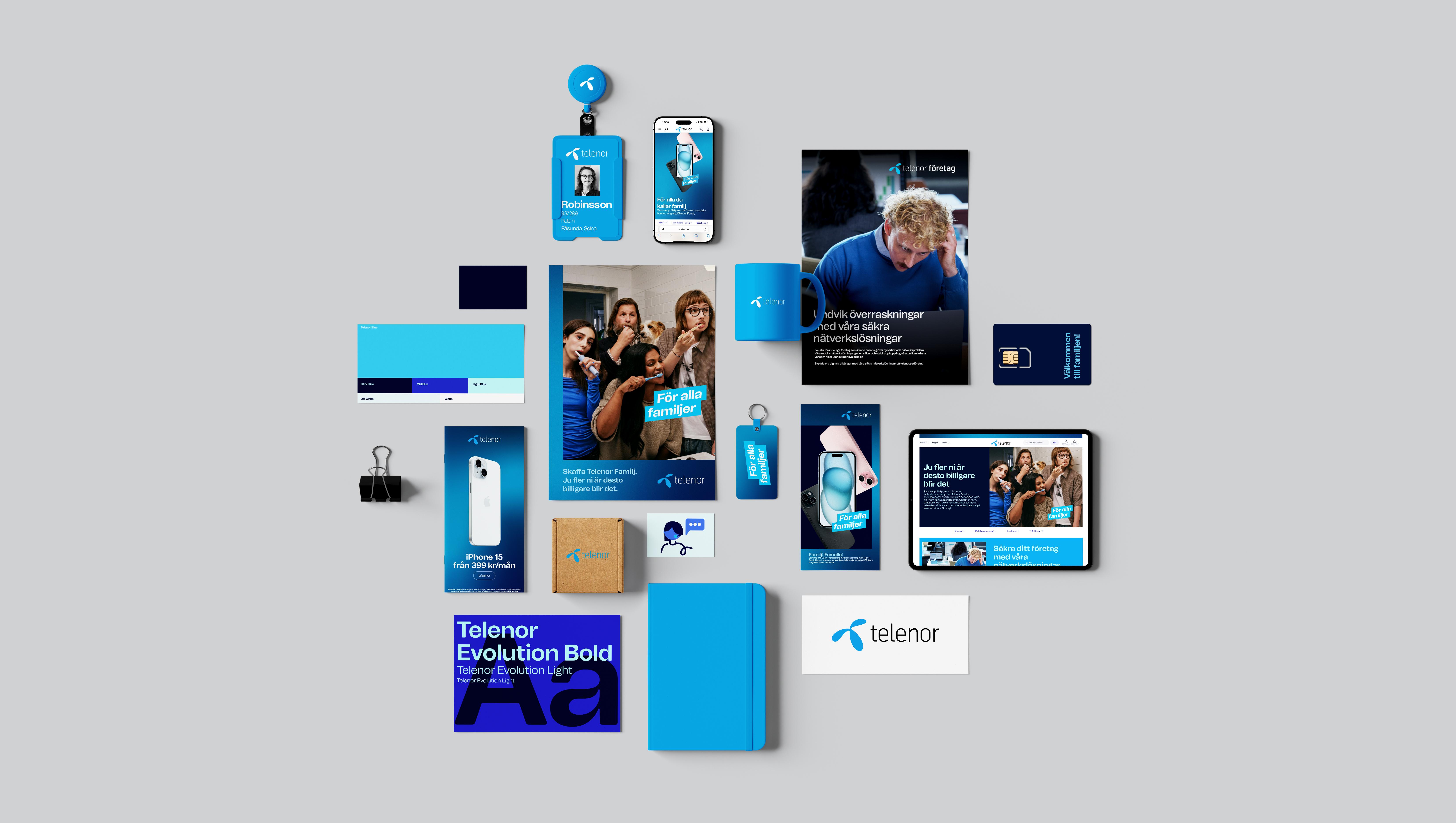
Our fixed and flexible assets
Our visual identity is our creative toolbox. It consists of several elements. Some of the elements are at the core of the Telenor brand. Their main task is to build recognition, and they are shared across all business units. We call these fixed assets.

1

2

3
- 1Logo
- 2Primary colors
- 3Our typography
Other elements can be adapted to fit to local market needs or specific target groups. We call these flexible assets.
Flexible assets