Brand Photography

01: Capture what
matters most
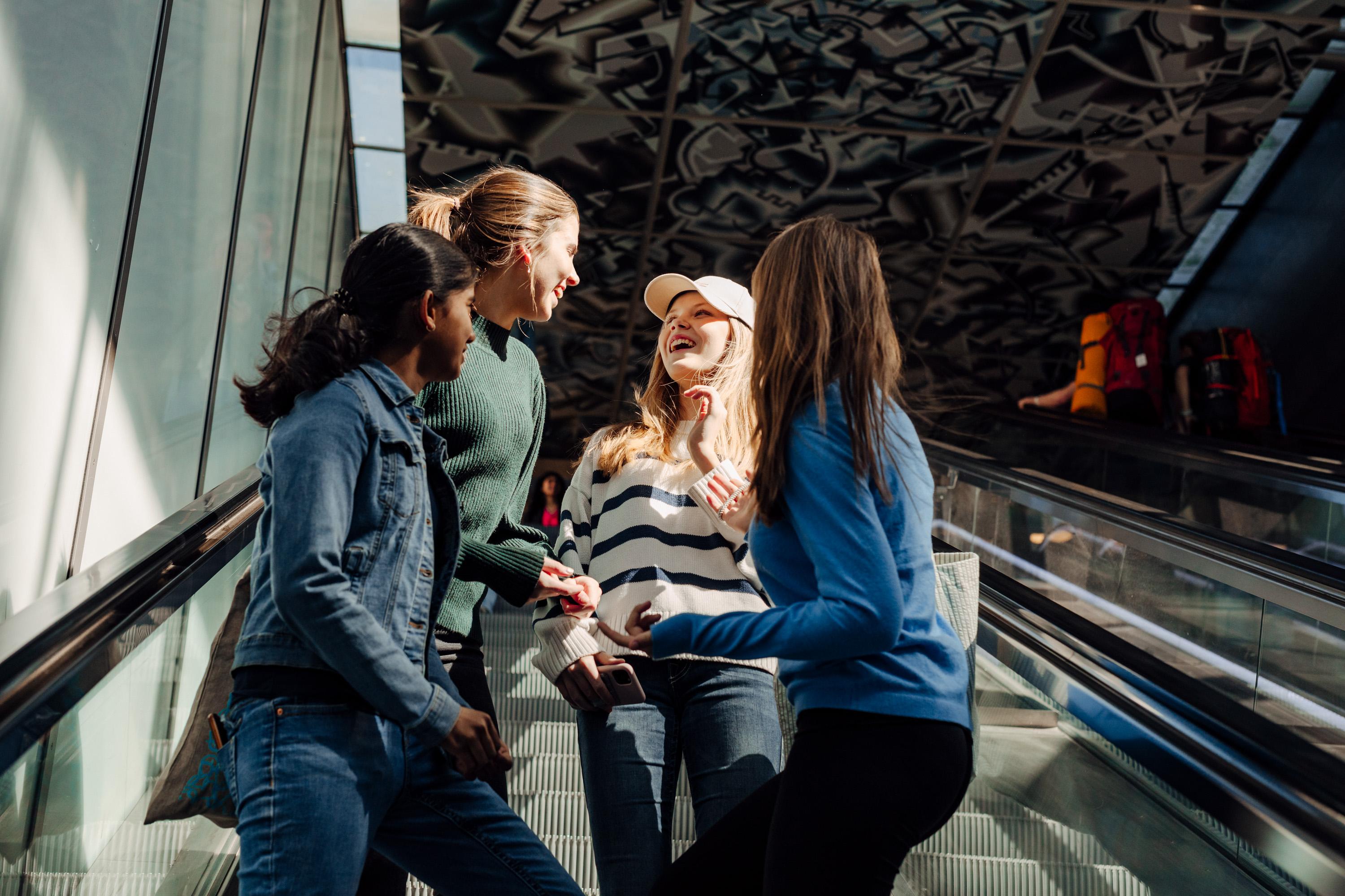
At the heart of the visual style is an unwavering focus on what truly matters:
people, relationships, and the moments that naturally unfold between them.
The camera should feel as though it has been dropped into a living, breathing scene –
not arranging life, but observing it.

02: Natural, genuine,
true emotions
Avoid staged smiles or forced reactions. The aim is to preserve honesty: fleeting glances, unfiltered laughter, quiet intimacy, or the subtle tension of anticipation. Emotions should feel lived rather than performed.
Seek the balance between closeness and curiosity. Choosing models that know each other is always a good tip!

03: Scenes of colour
Whilst the brand may lean towards certain tones, the imagery should embrace a full, rich colour palette. Warm, vibrant colours in details; skin tones, clothing, street life, objects – add authenticity and humanity. Always.
Urban scenes should highlight the diversity and vibrancy of city life – colourful buildings, dynamic light, varied textures. Grey concrete should never overpower;
let the city breathe in full spectrum.

04: Capture the moment
Natural poses: Allow subjects to exist freely in their environment without correction or direction into “better” positions.
Interesting angles: Choose perspectives that feel immersive; over shoulders, shadows, through hands, from ground level, partially obscured.
Movement: Blur, motion, and dynamic framing are welcomed; they add authenticity and a sense of life. Spontaneity, and moments of joy give the images a playful edge
Lean into unpredictability: hair in the wind, hands reaching, reflections, overlapping bodies. Let the energy of real life shape the frame.

05: Gadgets – secondary
or not present
Technology and devices should never dominate the story. When they appear, they do so as tools enabling connection – not as the reason for the moment. In many images, the digital gadgets are not needed at all.

06: Keep it natural
and authentic
Keep environments true to reality. Avoid stylised filters or overly processed looks. Whether it’s a forest, a kitchen, or a football pitch, the surroundings should feel untouched, familiar, and honest.

07: Experimental
perspectives and crops
Cut into the frame. Crop unexpectedly. Break symmetry. Allow objects to pass in front of the lens. These elements create immediacy, as though the viewer is standing within the moment rather than observing from a distance.
08: AI Generated images
AI is a creative tool, not a shortcut. Every image must reinforce clarity, credibility and brand integrity. These guidelines goes for all images both internal and external.
AI-generated images can be used when they:
Meet the same quality requirements as other visual materials. Align with our visual style and brand guidelines. Are clearly identifiable as illustrations, not realistic photographyWe do not use AI-generated images that:
Could be mistaken for real photographs. Imitate, reference or mimic the style of recognisable artists. Replicate copyrighted or proprietary visual expressions. Introduce people, scenarios or objects that could be interpreted as factualConceptual Foundation


