
Icons & Pictograms
In our B2C brand, icons are primarily used in digital. They are unctional and simple, existing to provide clarity. They work really well for wayfinding, both online and in physical spaces and have been designed to work perfectly at small sizes. Designed to tie in with our pictogram style, we use a continous line and rounded corners.
Download
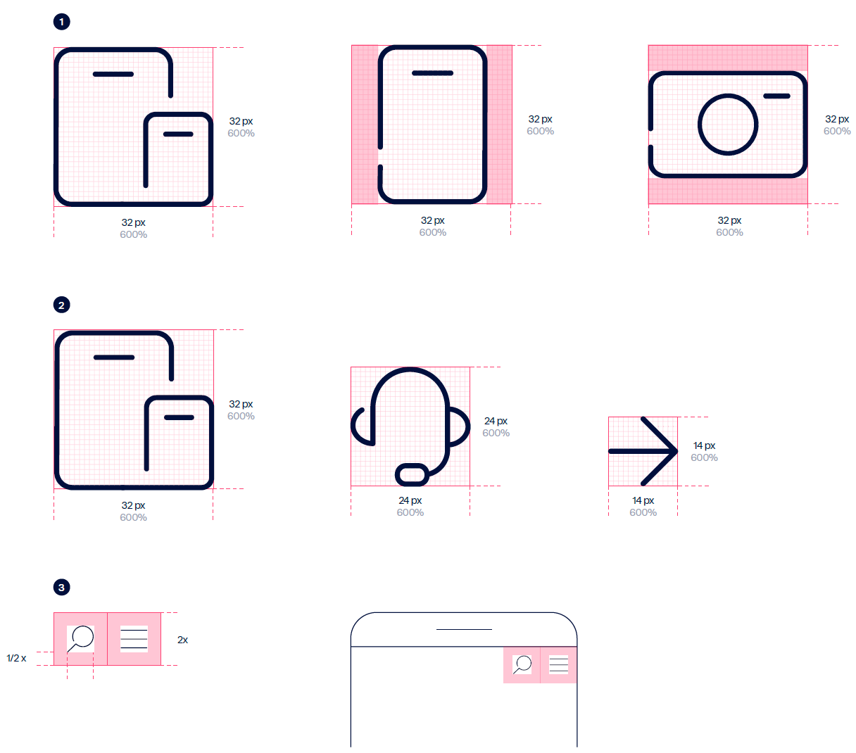
1. Icon shapes
All icons are designed within a square, which comes in three sizes (14, 24 & 32 px). The icons don’t have to fill the square but must not be taller or wider than each of the three available square sizes.
2. Icon 1sizes
Main icons are created within 32 px squares, on a 32 x 32 px grid. Button icons are created within 24 px squares, on a 24 x 24 px grid. Glyph icons are created within 14 px squares, on a 14 x 14 px grid
3. Clearance
Adequate space around each icon is needed to allow for legibility and touch.
X equals the height of the icon. Leave a clear space of 1/2x round the icon.
Icons Line style
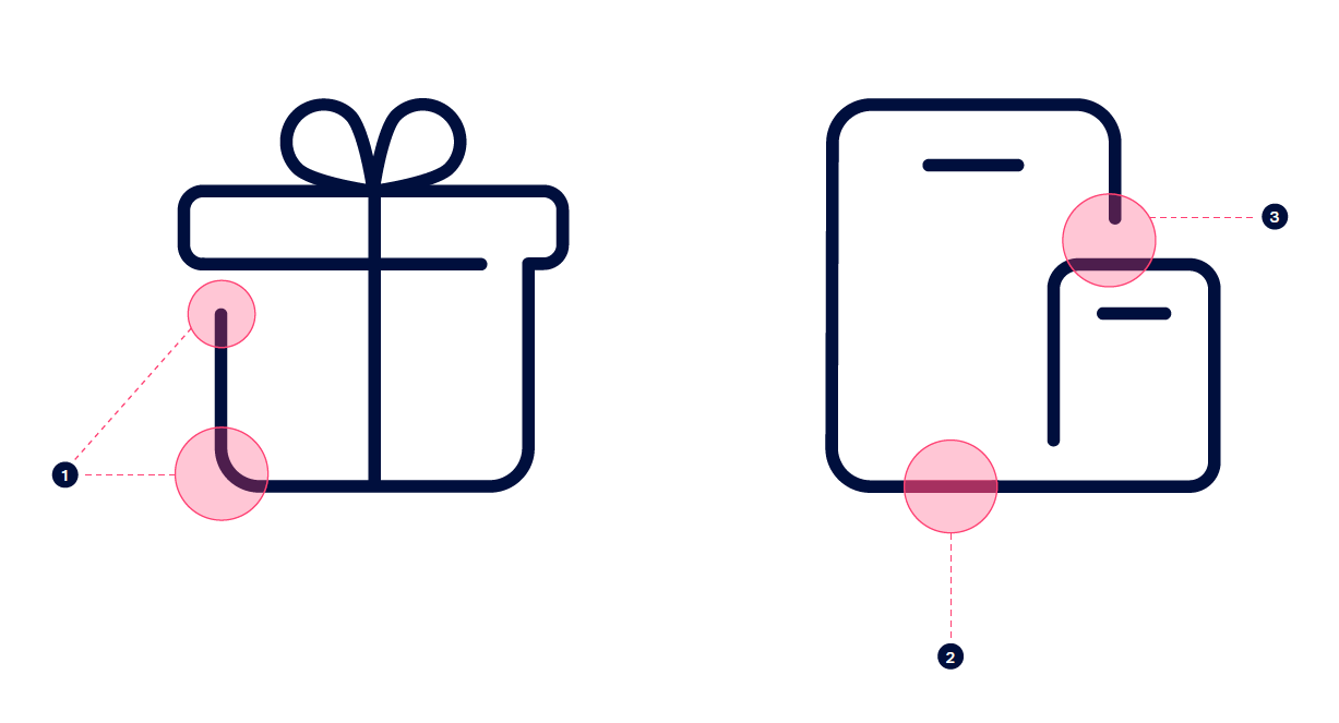
The icons have been created by modifying the existing Telenor set. Use the following modifications to create more. * Values apply to 32 x icons. Rounded corners Round corners to 3pt and use rounded line terminals to create human and friendly icons.
Stroke
Set the stroke weight to 1 pt at all three icon sizes. Connected line Leave a gap of 3 px between terminals to create the look of a single line drawing. Use this once per icon to avoid fragmenting the icon. Note: In order to maintain legibility at small sizes, don’t apply the connected line to Glyph Icons.
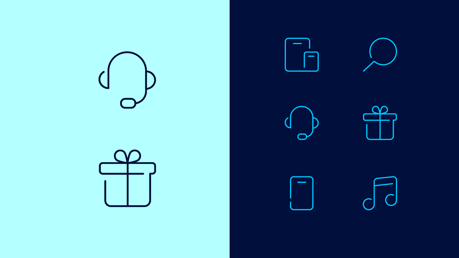
Icons Examples
Here are some examples of the icons in use.

Pictograms
Pictograms help us convey our complex offers and services with humanity and expression. In our B2C brand, pictograms are primarily used in digital. They have been designed to aid storytelling. They are designed for larger formats and can be more complex than our icons. Distinctive continuous lines have been developed to capture a feeling of connectivity whilst rounded corners keep the pictograms friendly and approachable.
Download
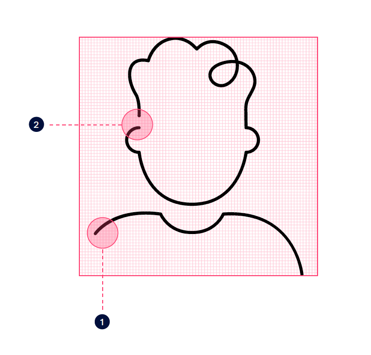
Pictograms line style
The pictograms have been created by modifying the existing Telenor set. Use the following modifications to create more.
1. Rounded terminals
Use rounded line terminals to create human and friendly icons.
2. Connected line
Leave a gap between terminals to create the look of a single line drawing. Use this sparingly to avoid fragmenting the pictogram.
3. Fluid loops
Fluid loops emphasise a sense of connection. Use them sparingly.
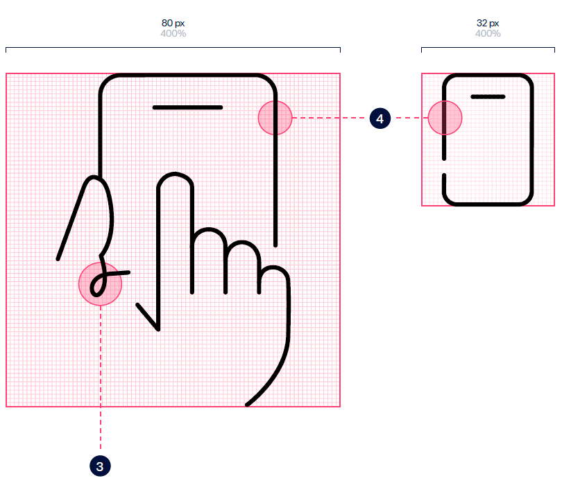
4. Stroke
Pictogram stroke weight should be the same weight as any navigational icons within a given layout.
In the example, the pictogram is drawn on an 80 x 80 px grid with a stroke weight of 1 pt. This aligns with the stroke weight of our icons.
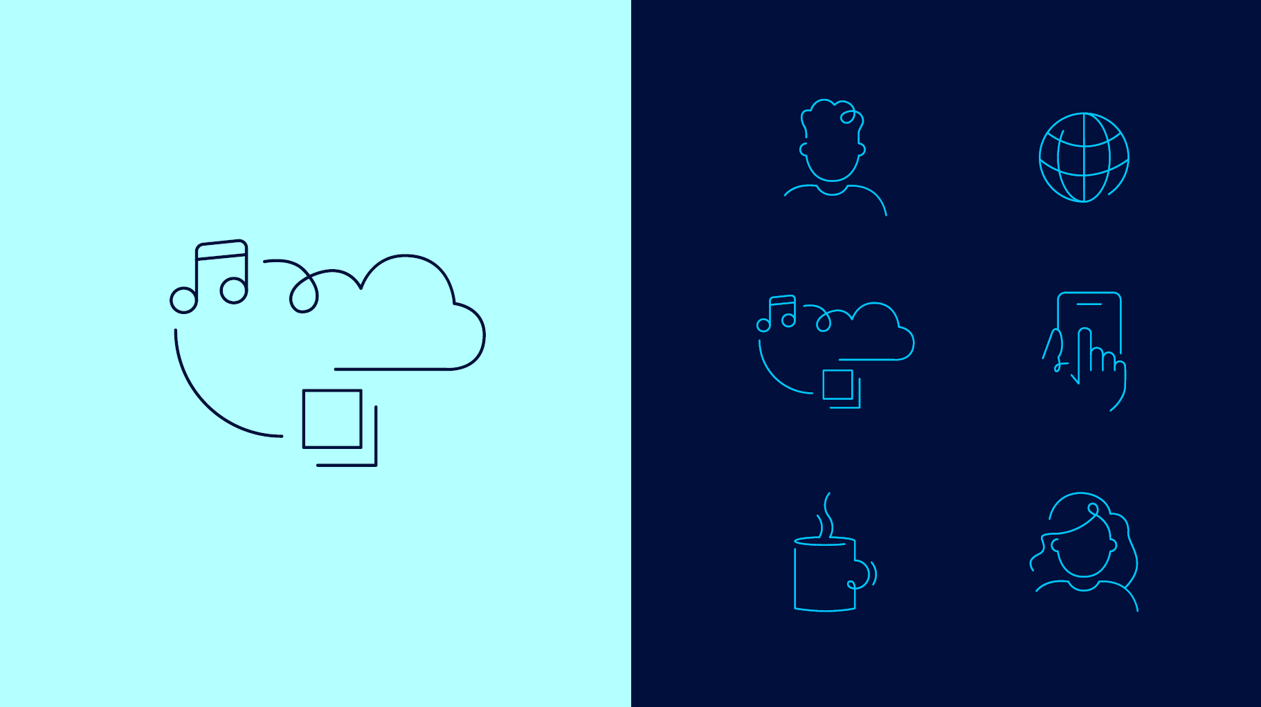
Pictograms Examples
Here are some examples of the pictograms in use.
